Creating a home that truly resonates with your spirit involves more than selecting furniture and arranging objects—it requires understanding how color can transform both mood and perception. I’ve found that the most successful interiors emerge when we approach color selection as both an art and a science, combining psychological insights with practical application principles.
Understanding the Science Behind Color Psychology
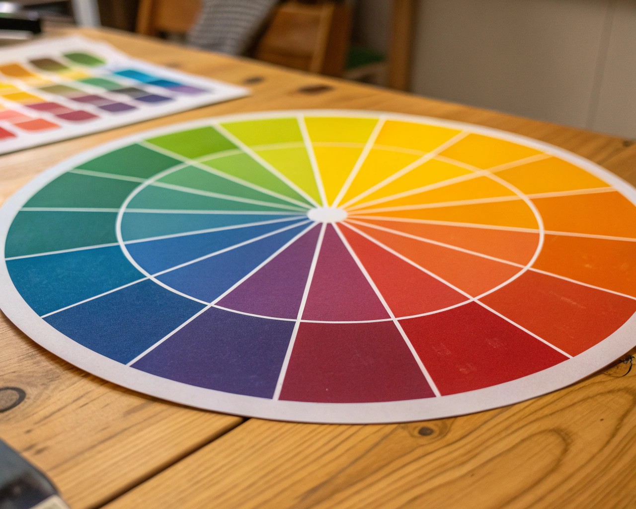
Color psychology operates on the principle that different wavelengths of light trigger distinct neurological responses in our brains. When we enter a space painted in warm reds or oranges, our heart rate naturally increases and we feel more energized. Conversely, cool blues and greens activate our parasympathetic nervous system, lowering blood pressure and promoting relaxation. This isn’t merely aesthetic preference—it’s rooted in evolutionary biology where certain colors signaled safety, food sources, or danger.
The science becomes more nuanced when we consider color temperature and undertones. Each hue carries either warm (yellow-based) or cool (blue-based) undertones that influence how we perceive both the color itself and the surrounding space. Understanding these undertones allows us to create environments that support specific activities and emotional states throughout our homes.
The Foundation: Color Theory Essentials
Primary Relationships and Their Applications
The color wheel serves as our fundamental tool for creating harmonious relationships. Primary colors—red, yellow, and blue—form the basis for all other hues, while secondary and tertiary combinations offer sophisticated palette opportunities. In practice, I’ve discovered that complementary colors (opposites on the wheel) create dynamic, energizing spaces perfect for social areas, while analogous colors (neighbors on the wheel) establish calm, cohesive environments ideal for bedrooms and study spaces.
Monochromatic schemes deserve special attention for their psychological impact. Using varying shades, tints, and tones of a single color creates visual coherence while allowing texture and form to take precedence. This approach particularly benefits smaller spaces or areas where you want to encourage focus rather than stimulation.
The 60-30-10 Principle in Practice
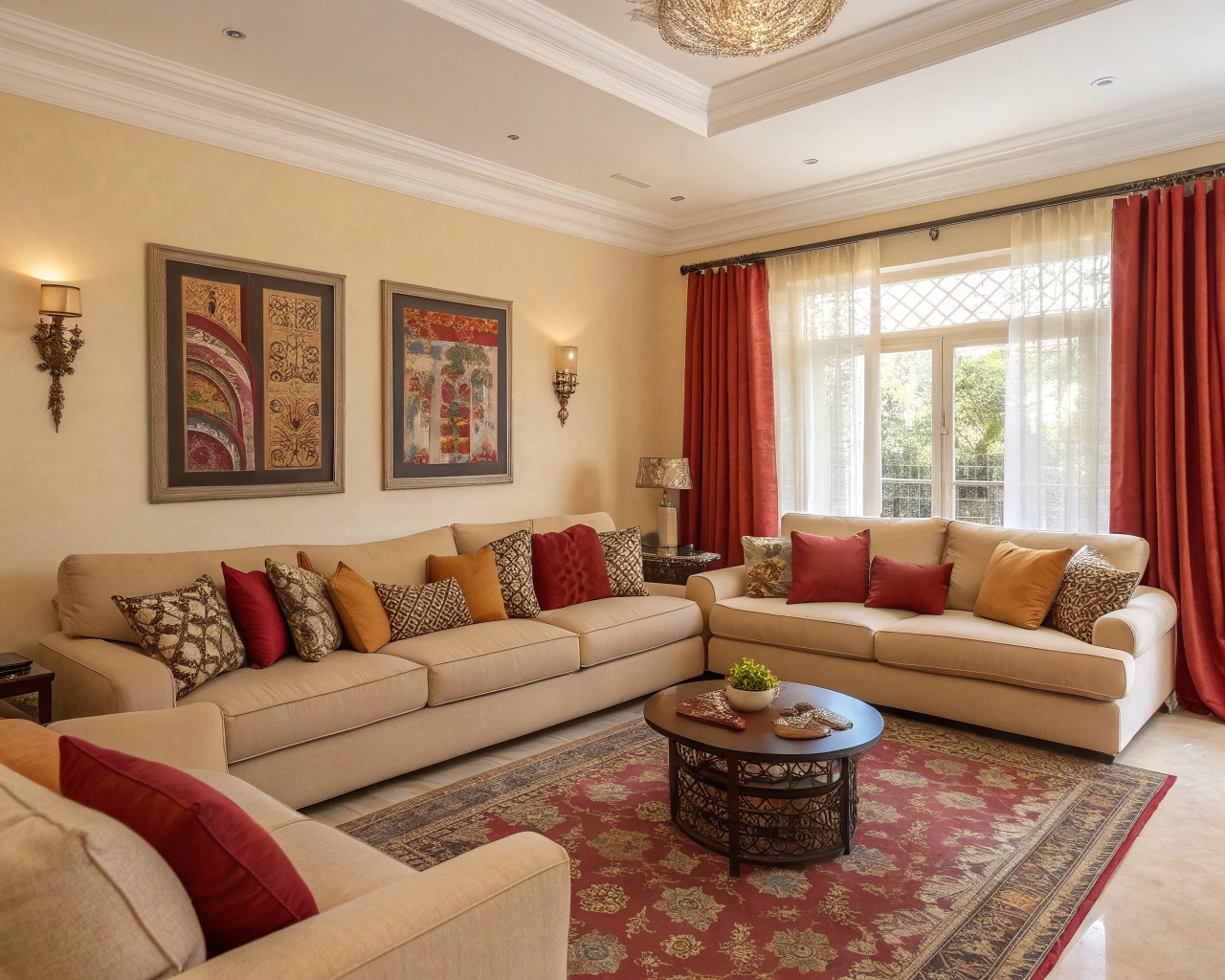
Professional color distribution follows a proven formula: 60% dominant color, 30% secondary color, and 10% accent color. This creates visual balance while preventing color overwhelm. In a living room, this might translate to neutral walls (60%), upholstered furniture in a complementary hue (30%), and vibrant throw pillows or artwork (10%).
Room-Specific Color Strategies
Living Spaces: Fostering Connection and Comfort
Living rooms function as the social heart of the home, requiring colors that encourage both relaxation and conversation. Warm earth tones—soft browns, muted oranges, and golden yellows—create an inviting atmosphere that makes guests feel immediately at ease. These colors also have the psychological effect of making large spaces feel more intimate and manageable.
For families who entertain frequently, consider incorporating deeper jewel tones as accent colors. Rich emerald greens or sapphire blues provide sophistication while maintaining warmth. The key lies in balancing these statement colors with plenty of neutral breathing room.
Kitchens: Energizing Culinary Creativity
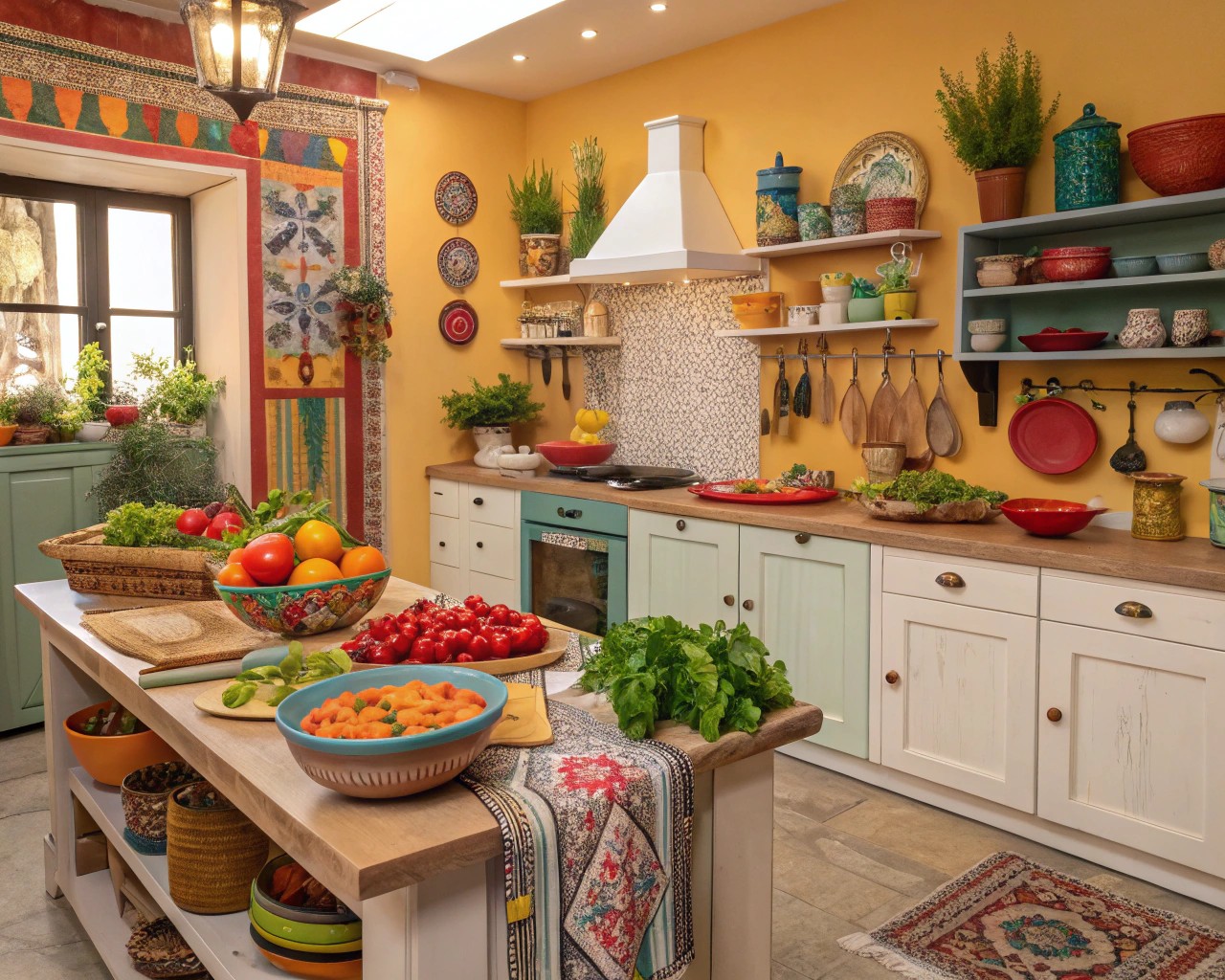
Kitchen color psychology centers on appetite stimulation and energy maintenance. Orange and its variations prove particularly effective, as this color naturally enhances comfort and security while providing the energy needed for food preparation. Sage greens offer an alternative approach, balancing emotional stability with a fresh, clean aesthetic.
From a practical standpoint, I recommend using stronger colors on lower cabinets or accent walls rather than dominating the entire space. This approach allows for easy updates while maintaining the room’s energetic qualities.
Bedrooms: Creating Restorative Sanctuaries
Sleep quality directly correlates with color choices in the bedroom environment. Blues consistently rank as the most effective color for promoting rest, as they naturally lower blood pressure and heart rate. This isn’t limited to bright blues—soft gray-blues, powder blues, and even blue-tinged whites create similar physiological responses.
For those who find blue too cold, muted greens with blue undertones provide similar calming effects while adding natural warmth. Avoid pure yellow or bright orange in bedrooms, as these colors can overstimulate the nervous system and interfere with melatonin production.
Bathrooms: Balancing Function and Serenity
Bathroom color selection requires consideration of both practical needs and psychological comfort. Soft blues and whites create the spa-like atmosphere most people desire, while also providing the clean, fresh feeling essential for morning routines. These colors reflect light effectively, making smaller bathrooms appear larger and brighter.
For powder rooms or guest bathrooms, you have more flexibility to experiment with bolder choices, as these spaces receive shorter, less frequent use.
Lighting’s Transformative Impact on Color
Natural Light Considerations
The direction your rooms face significantly affects how colors appear throughout the day. North-facing rooms receive soft, cool light that can make warm colors appear muted and cool colors seem more pronounced. South-facing spaces get intense, warm light that can wash out pale colors while making darker hues appear brighter.
East-facing rooms experience cool morning light followed by neutral afternoon conditions, while west-facing spaces reverse this pattern with warm evening light. Understanding these patterns allows you to select colors that work harmoniously with your home’s natural light patterns rather than fighting against them.
Artificial Lighting’s Color Temperature Effects
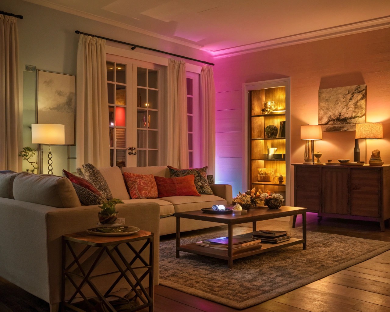
The color temperature of your artificial lighting, measured in Kelvin (K), dramatically influences how paint colors appear. Warm light (2700K-3000K) enhances reds, oranges, and yellows while muting cooler tones. Cool light (4000K-5000K) does the opposite, brightening blues and greens while subduing warm colors.
For most residential applications, I recommend 3000K bulbs as they provide a neutral baseline that doesn’t dramatically shift color perception. However, consider using warmer temperatures (2700K) in bedrooms and dining areas for comfort, and cooler temperatures (3500K-4000K) in kitchens and workspaces for clarity.
Creating Color Flow Throughout Your Home
Establishing Visual Continuity
Successful whole-home color schemes rely on strategic repetition rather than monotonous uniformity. Choose one “hero” color that appears in every room—perhaps as wall color, accent pieces, or undertones. This creates subliminal connections that help spaces feel cohesive even when their primary palettes differ.
Transitional spaces like hallways and entryways play crucial roles in color flow. These areas benefit from neutral colors that complement adjacent rooms while providing visual rest between more colorful spaces.
Managing Color Transitions
When rooms are visible from one another, their color relationships become critical. Colors don’t need to match exactly, but they should share similar undertones or temperature families. A warm gray in the living room can flow beautifully into a soft sage in the dining area if both colors share yellow undertones.
Use white or off-white trim as a unifying element that helps different wall colors coexist harmoniously. This classic approach provides visual boundaries while maintaining overall cohesion.
Seasonal Color Adaptations
Understanding Seasonal Psychology
Our color preferences naturally shift with the seasons, influenced by changes in light quality and psychological needs. Spring palettes featuring fresh greens, soft yellows, and clean whites reflect our desire for renewal and growth. Summer colors lean toward cooler blues, soft grays, and crisp whites that provide psychological relief from heat.
Autumn brings comfort-seeking behaviors that respond well to rich burgundies, deep oranges, and warm browns. Winter palettes focus on sophisticated deep tones—navy blues, charcoal grays, and rich jewel tones that create cozy, introspective environments.
Implementing Seasonal Flexibility
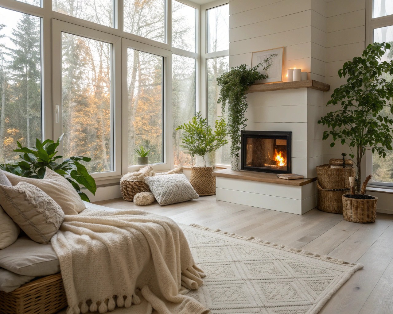
Rather than repainting seasonally, create adaptable color schemes through accessories and accent pieces. Neutral base colors provide the perfect backdrop for seasonal layering through textiles, artwork, and decorative objects. A room with cream walls and beige upholstery can feel summery with blue and white accessories, then transform for autumn with rust and gold accents.
Practical Application Guidelines
Color Testing Methodology
Always test paint colors in your actual space using large samples (at least 12″x12″) viewed under different lighting conditions throughout the day. Colors that look perfect under store lighting often appear dramatically different in your home environment.
Paint test patches on different walls within the same room, as lighting varies significantly even within a single space. Observe these samples for at least 48 hours before making final decisions.
Common Color Mistakes to Avoid
Ignoring undertones represents the most frequent color selection error. Even neutrals carry warm or cool undertones that must harmonize with your lighting and existing elements. Choosing colors based solely on small swatches without considering the room’s size, lighting, and function often leads to disappointing results.
Over-matching creates sterile environments, while under-planning color relationships results in chaotic, uncomfortable spaces. Aim for harmonious variation rather than perfect matching or complete randomness.
Professional Tips for Color Success
Working with Existing Elements
Start your color selection process by identifying fixed elements—flooring, countertops, built-ins—that must be accommodated. These elements often contain multiple undertones that can guide your overall palette direction.
Use the largest pattern or artwork in the room as inspiration for your color scheme. This approach ensures all elements work together cohesively while preventing the common mistake of selecting colors that compete with existing focal points.
Building Confidence with Color
Begin with one room to develop your color confidence before tackling the entire home. Choose a low-stakes space like a powder room or home office for experimentation. Success in smaller spaces builds the confidence needed for larger color commitments.
Remember that paint is relatively inexpensive and easily changed. The cost of repainting pales in comparison to living with colors that don’t support your daily life and emotional well-being. Trust your instincts while applying these scientific principles to create spaces that truly reflect your personality and enhance your quality of life.
Color selection represents both an art and a science, requiring technical knowledge balanced with personal intuition. By understanding color psychology, considering lighting effects, and planning for long-term livability, you can create interiors that not only look beautiful but actively support your daily well-being and emotional health. The investment in thoughtful color planning pays dividends in increased comfort, productivity, and genuine joy in your living spaces.

