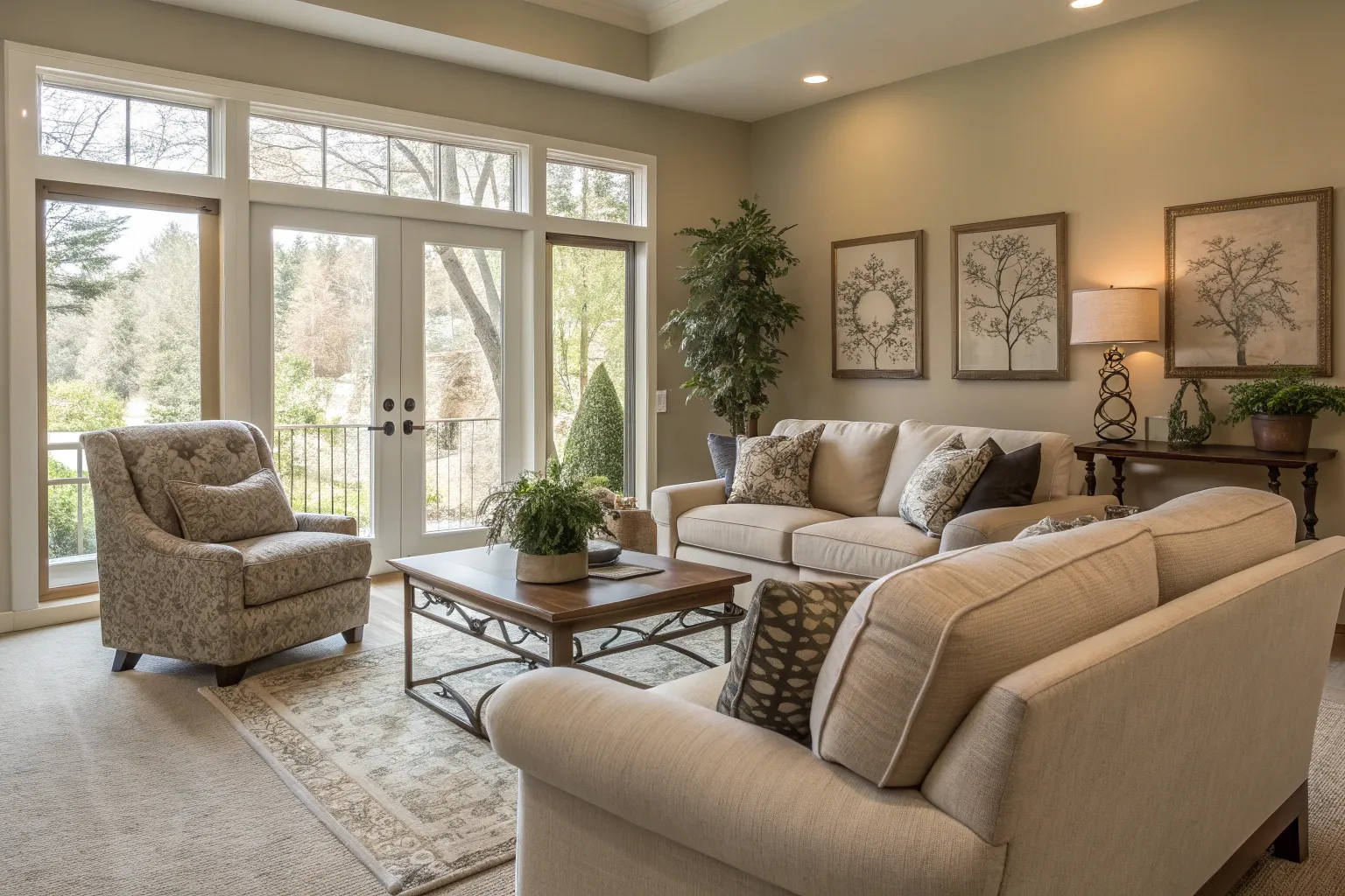
Neutral tones possess an almost mystical quality in the design world—they’re simultaneously invisible and indispensable. When I walk into a space dominated by neutrals, there’s an immediate sense of calm that settles over me, a feeling I’ve witnessed countless times with clients and colleagues alike.
The Science of Serenity
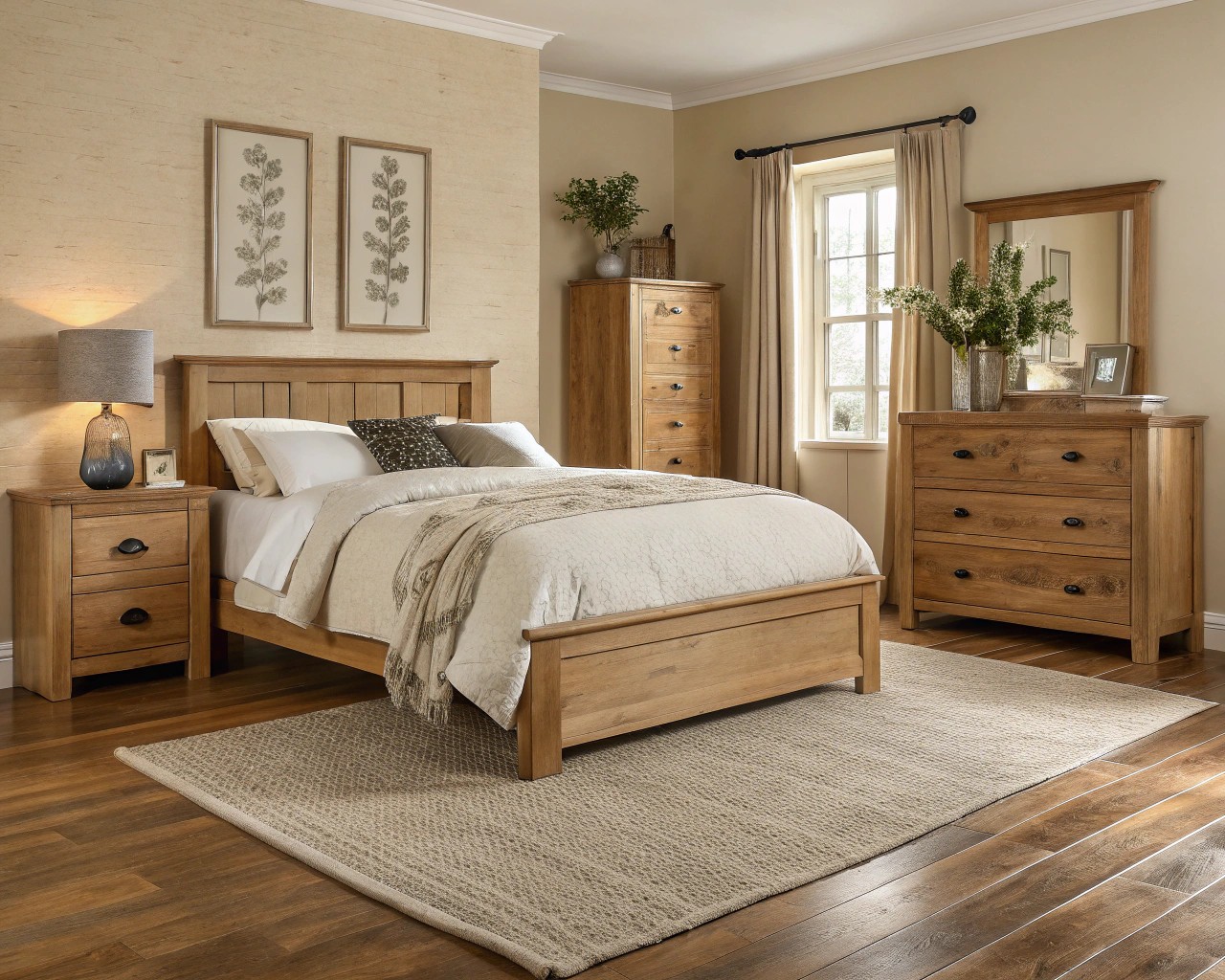
The psychological impact of neutral colors stems from their inherent restraint. Unlike vibrant hues that demand attention and trigger specific emotional responses, neutrals operate at a more subliminal level. Research indicates that our brains process neutral environments as less stimulating, which naturally promotes relaxation and reduces cognitive load. This is particularly important in our increasingly overstimulated world, where homes serve as sanctuaries from the constant barrage of visual information we encounter daily.
The calming effect isn’t merely anecdotal—it’s rooted in our evolutionary psychology. Natural neutral tones—the browns of earth, the grays of stone, the whites of clouds—represent safety and stability in our subconscious minds. When we surround ourselves with these colors, we’re essentially creating an environment that feels fundamentally secure and grounding.
Key Benefits of Neutral Color Psychology:
- Reduce visual stress and promote mental clarity
- Create spaces that feel larger and more open
- Support better sleep patterns in bedrooms
- Enhance focus and productivity in work areas
The Architecture of Light
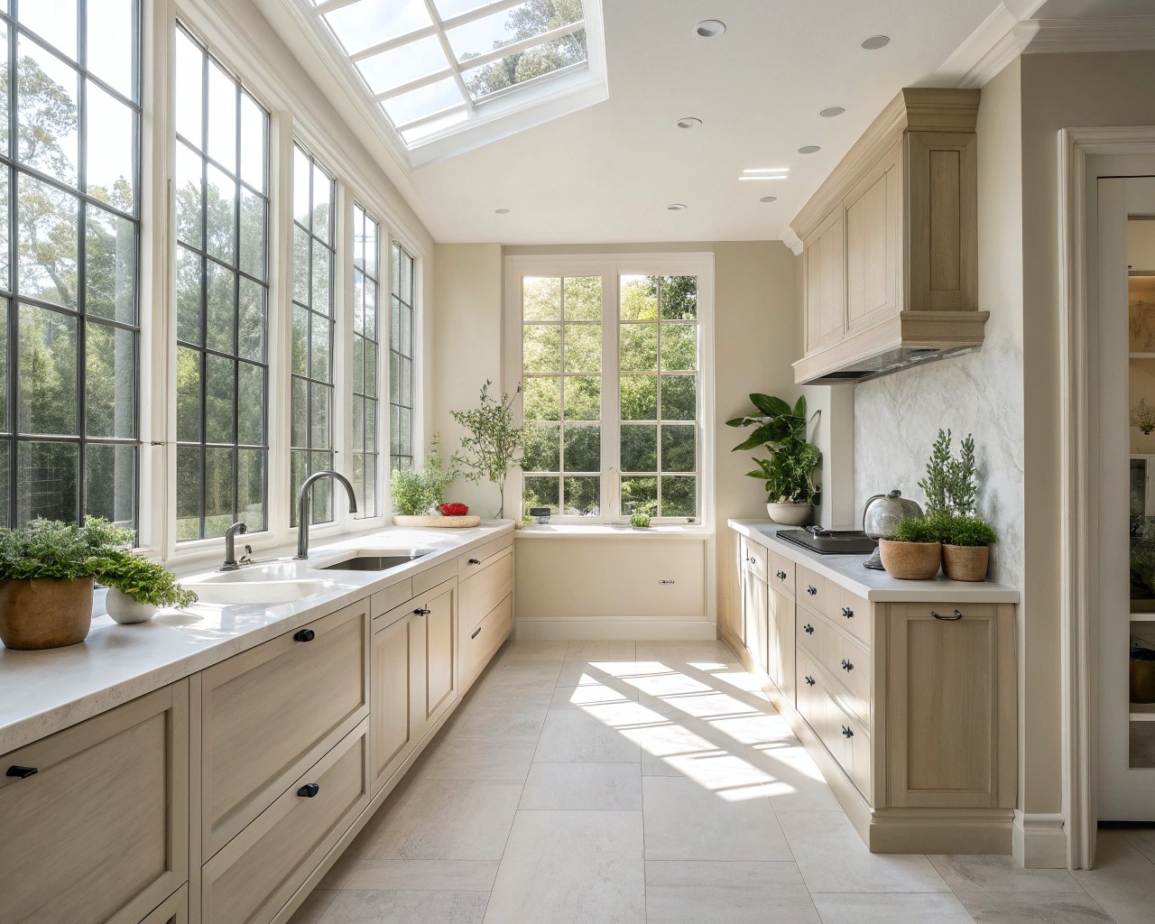
One of the most compelling reasons neutrals remain perpetually relevant lies in their relationship with natural light. Light-reflecting neutrals can increase a room’s apparent brightness by up to 30%, effectively maximizing the value of every window in your home. This isn’t merely about aesthetics—it’s about creating healthier living environments that support our circadian rhythms and overall well-being.
The science behind this phenomenon involves the Light Reflectance Value (LRV), a measurement that quantifies how much light a color reflects. Whites typically have LRVs between 85-95, while light grays and beiges range from 50-70. By comparison, most saturated colors fall below 20. This means neutral walls act like gentle mirrors, bouncing natural light throughout your space and reducing dependence on artificial illumination.
Tips for Maximizing Light with Neutrals:
- Choose paint with higher LRV values for darker rooms
- Layer different neutral tones to create depth without losing brightness
- Use glossier finishes in areas with limited natural light
- Combine neutral walls with light-colored flooring for maximum reflection
The Power of Undertones
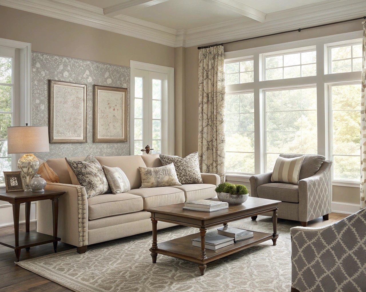
Understanding undertones is crucial to mastering neutral color schemes. Every neutral contains subtle hints of other colors—what we call undertones—that can dramatically affect how the color appears in different lighting conditions. Warm neutrals contain traces of yellow, peach, or red, while cool neutrals lean toward blue, green, or gray.
I’ve observed that the most successful neutral schemes carefully balance these undertones rather than fighting them. A beige with yellow undertones will feel cozier in a north-facing room, while a gray with blue undertones can cool down a space flooded with warm southern light. The key is recognizing that neutrals aren’t colorless—they’re colors that have been gently muted while retaining their essential character.
Understanding Neutral Undertone Categories:
| Undertone Type | Characteristics | Best Applications |
|---|---|---|
| Warm (Yellow-based) | Cozy, inviting, energizing | Living rooms, kitchens, south-facing spaces |
| Cool (Blue-based) | Crisp, calming, sophisticated | Bedrooms, bathrooms, north-facing areas |
| Neutral (Balanced) | Versatile, adaptable, harmonious | Any space, transitional areas |
Timeless Flexibility and Investment Value
The practical advantages of neutral color schemes extend far beyond their aesthetic appeal. When you invest in neutral foundations—whether paint, flooring, or major furniture pieces—you’re essentially future-proofing your design decisions. This flexibility translates into real economic value, as neutral spaces require fewer costly updates over time and maintain broader market appeal for resale.
I’ve witnessed this flexibility firsthand when working with clients who initially worry that neutrals might be “boring.” Instead, they discover that neutral backgrounds allow them to experiment with color through easily changeable elements like textiles, artwork, and accessories. This approach enables seasonal refreshes and style evolution without major renovations.
Smart Investment Strategies with Neutrals:
- Use neutrals for expensive, permanent elements (flooring, built-ins, major appliances)
- Invest in high-quality neutral furniture pieces that can move between rooms
- Choose neutral window treatments that complement multiple color schemes
- Select neutral tile and fixtures for bathrooms and kitchens
Garden and Landscape Applications
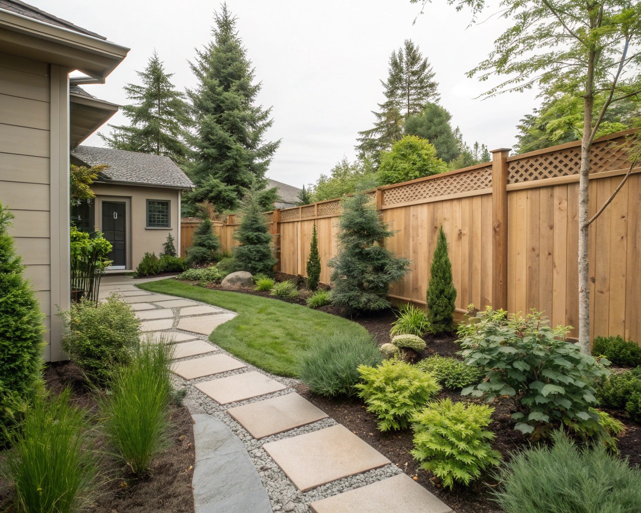
The principles that make neutrals successful indoors apply equally to outdoor spaces. In landscape design, neutral hardscaping materials—natural stone, weathered wood, concrete—provide the perfect backdrop for seasonal plant displays. These materials age gracefully, developing patinas that enhance rather than detract from their appearance.
Green functions as nature’s ultimate neutral in garden design, serving as both backdrop and bridge between different seasonal color palettes. By establishing a strong foundation of neutral hardscaping and evergreen plantings, you create a framework that supports year-round interest while allowing for seasonal color rotation through annual plantings and container gardens.
Essential Neutral Elements for Outdoor Spaces:
| Element | Materials | Benefits |
|---|---|---|
| Hardscaping | Natural stone, concrete, weathered wood | Durability, timeless appeal, low maintenance |
| Evergreen Structure | Boxwood, yew, juniper, ornamental grasses | Year-round interest, neutral backdrop |
| Seasonal Containers | Terra cotta, concrete, natural fiber | Flexible color introduction, easy updates |
| Water Features | Stone, concrete, weathered metals | Calming effect, architectural interest |
Current Trends and Future Relevance
As we move through 2025, the trend toward “earthy neutrals” reflects our growing desire to reconnect with nature while maintaining sophisticated design standards. Colors like warm grays, soft taupes, and muted beiges continue to dominate both interior and exterior applications because they satisfy our need for both comfort and style.
The sustainability movement has also reinforced the value of neutral color schemes. By choosing timeless, neutral foundations, we reduce the environmental impact associated with frequent redecorating and renovation. This aligns with growing awareness about the lifecycle costs of design decisions—both financial and environmental.
Trending Neutral Directions for 2025:
- Warmer beiges and taupes replacing cooler grays
- Muted, complex colors that shift subtly in different light
- Natural materials in their unfinished state
- Layered textures rather than color for visual interest
Creating Depth Without Drama
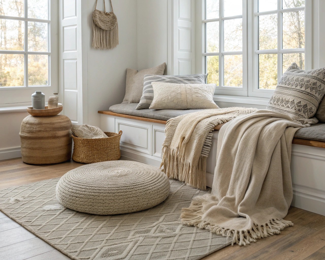
The misconception that neutrals create bland or lifeless spaces typically stems from a failure to understand the importance of layering and texture. The most compelling neutral spaces feature careful attention to varying textures, finishes, and subtle tonal variations. Think of how different materials—linen, wool, leather, wood, stone—each contribute their unique textural quality while maintaining tonal harmony.
In my experience, successful neutral schemes require more, not less, attention to detail. Without the drama of bold color to carry visual interest, every element must earn its place through careful consideration of scale, texture, and subtle color variation.
Texture Layering Techniques:
- Mix matte and glossy finishes within the same color family
- Combine natural and manufactured materials
- Vary the scale of patterns and textures
- Include both smooth and tactile surfaces
Seasonal Adaptability
One of neutrals’ greatest strengths lies in their ability to support seasonal transitions without requiring major changes. A neutral foundation allows you to embrace the cozy textures of winter, the fresh lightness of spring, the relaxed comfort of summer, and the rich warmth of autumn through simple additions and subtractions.
This seasonal adaptability extends to both indoor and outdoor spaces. Neutral patios and terraces can be transformed with seasonal plantings, textiles, and lighting while maintaining their fundamental character. The neutral backdrop remains constant while the seasonal elements provide variety and change.
Seasonal Enhancement Strategies:
| Season | Indoor Additions | Outdoor Elements |
|---|---|---|
| Spring | Light linens, fresh flowers | Cool-season annuals, new container plantings |
| Summer | Breathable fabrics, minimal accessories | Lush foliage, outdoor dining elements |
| Fall | Warm throws, rich textures | Autumn containers, textural grasses |
| Winter | Cozy layers, warm lighting | Evergreen arrangements, structural elements |
The enduring appeal of neutral tones lies not in their simplicity, but in their sophistication. They provide the rare combination of immediate comfort and long-term flexibility that makes them as relevant today as they will be in decades to come. Whether you’re planning a complete renovation or simply refreshing a single room, neutral foundations offer the most reliable path to creating spaces that feel both timeless and deeply personal.
(

